project 3

Original Page:
www.supersnouts.com

SuperSnout’s Refresh started with a deep analyzing of the brand's core identity. The brand portrays a “save the day” attitude-rooted in empowering pets with trustworthy, organic supplements. However, the brands homepage lacked a few elements that evoked "SUPER" energy.
Here’s a Breakdown...
- The site’s hero section falls short, delivering a muted experience that underplays the brand's dynamic essence. While green effectively conveys freshness and renewal, it lacks the electrifying "super" vibe needed for a inspiring.
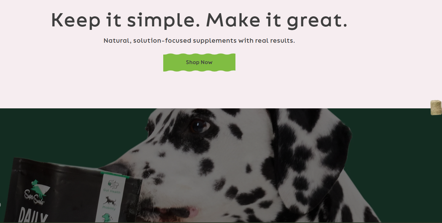
- The current site's color cohesiveness struggles. The hero section starts with a fresh green palette but abruptly shifts to a mix of yellows, purples, and other hues without smooth integration, leading to a disjointed feel.
- Although it's an appealing color, the clash with the font's color, size, and the background might feel harsh, resulting in accessibility problems.
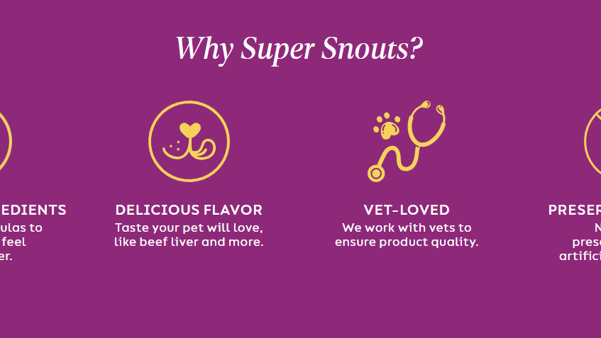
- Title font in italic can be hard to read and doesn't always effectively pull attention.
Refresh Overview
A 3-column layout within a standard 12-column grid system was devised to achieve a balanced, symmetrical structure. This choice allows the inclusion product spotlight, and Call-to-Action to span across the hero section evenly, ensuring clean alignment and easy scanning on wider screens.
Header
Content
CTA
Color & Typography
Magenta
#8E297A
Yellow
#F7D259
Light Green
#90C340
Sky Blue
#8ECAEE
Charcoal
#414141
Poppins
X
Bitter
Hero Section
The primary objective of the hero section is to deliver a sense of direction while highlighting the brand's offerings via an engaging grid layout. Key design updates incorporate a comic-style textured city background, featuring a small logo icon of the dog soaring above the skyline, along with a refreshed font for the CTA title as well as a new improvised button to infuse a more playful vibe.
Why Us Section
As mentioned, the previous design may have been a bit harsh on the eyes, so I updated the background to an above-the-clouds aesthetic to better align with the overall theme. A NASC seal was also included for legitimacy.
Benefits Section
The benefits section was revamped to feel more dynamic and engaging.
Thank You!
Other projects:

Case Study - Event Management App.
2024

Style Management App.
2025

Coming Soon...
N/A
Coming Soon...
N/A


Original Page:
www.supersnouts.com
SuperSnout’s Refresh started with a deep analyzing of the brand's core identity. The brand portrays a “save the day” attitude-rooted in empowering pets with trustworthy, organic supplements. However, the brands homepage lacked a few elements that evoked "SUPER" energy.
Here’s a Breakdown...
- The site’s hero section falls short, delivering a muted experience that underplays the brand's dynamic essence. While green effectively conveys freshness and renewal, it lacks the electrifying "super" vibe needed for a inspiring.
- The current site's color cohesiveness struggles. The hero section starts with a fresh green palette but abruptly shifts to a mix of yellows, purples, and other hues without smooth integration, leading to a disjointed feel.
- Although it's an appealing color, the clash with the font's color, size, and the background might feel harsh, resulting in accessibility problems.
- Title font in italic can be hard to read and doesn't always effectively pull attention.
Refresh Overview
A 3-column layout within a standard 12-column grid system was devised to achieve a balanced, symmetrical structure. This choice allows the inclusion product spotlight, and Call-to-Action to span across the hero section evenly, ensuring clean alignment and easy scanning on wider screens.
Header
Imagery
Content
CTA
Color & Typography
Poppins
X
Bitter
Hero Section
The primary objective of the hero section is to deliver a sense of direction while highlighting the brand's offerings via an engaging grid layout. Key design updates incorporate a comic-style textured city background, featuring a small logo icon of the dog soaring above the skyline, along with a refreshed font for the CTA title as well as a new improvised button to infuse a more playful vibe.
Why Us Section
As mentioned, the previous design may have been a bit harsh on the eyes, so I updated the background to an above-the-clouds aesthetic to better align with the overall theme. A NASC seal was also included for legitimacy.
Benefits Section
The benefits section was revamped to feel more dynamic and engaging.
Thank You!
Other projects:
Case Study - Event Management App.
2024
Style Management App.
2025
Coming Soon...
N/A
Coming Soon...
N/A
Phone: 443-572-9470
Email: prosper5208@live.com